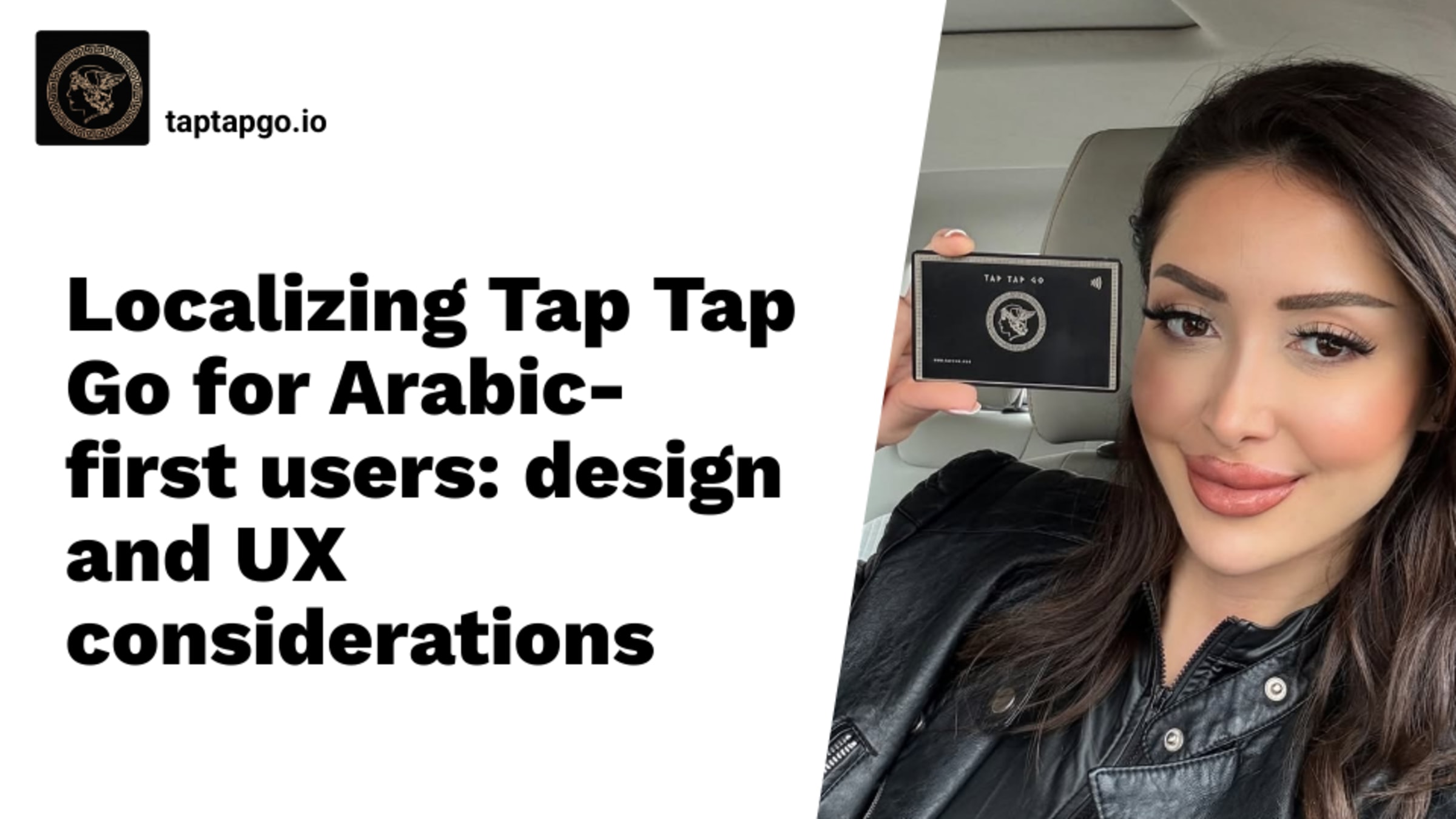
Localizing Tap Tap Go for Arabic-first users: design and UX considerations
A fintech brand launched its loyalty card program across three GCC markets last year. They translated every string into Arabic, flipped the language setting, and called it localized. Within 60 days, card share rates in Saudi Arabia were 40% below their European benchmarks — and their support queue was full of Arabic users asking why the app "looked broken."
Localizing a digital card for Arabic-first users means rebuilding the layout logic, not just the language. RTL text direction, bidirectional character handling, Arabic-specific typography, cultural color associations, and regional data formats are all structural decisions — not styling choices. Translation is the last 10%. The first 90% is everything most platforms skip.
We underestimated this ourselves. Early versions of TAPTAPGO's card templates were built LTR-first and retrofitted for Arabic. The rendering held. The experience did not. That gap taught us the difference between a product that supports Arabic and a product built for Arabic users.
Most localization efforts stop exactly where the damage starts.
RTL Layout Is the Foundation of Arabic UX — Not an Afterthought
Flip the text direction and you have not localized anything — you have exposed every assumption your design team baked in from the start. Navigation, card hierarchy, icon placement, CTA positioning: all of it must mirror correctly in RTL, not approximate it. A back arrow pointing the wrong way is not a minor bug. It tells the user this product was not built for them.
Bidirectional text breaks most card designs that were built LTR-first. The moment Arabic script sits next to a Latin URL or a numeric loyalty code, default rendering collapses — and the layout reads as broken, not bilingual.
Typeface choices compound the damage. Cairo, Noto Naskh Arabic, and Tajawal hold quality at small sizes. Generic system fonts do not. Poor Arabic rendering at 12px destroys perceived brand quality faster than any off-palette color choice.
Getting RTL wrong is not a design flaw — it is a brand trust failure.
Arabic-First UX Design Means Rethinking the Entire Card Experience
Arabic readers scan right-to-left in an reversed F-pattern. Your headline, member name, and primary CTA belong on the right side of the card — not centered, not left-anchored.
Arabic script runs visually denser than Latin. Padding, line-height, and container sizing that work in English will compress Arabic text into an unreadable block. Every spacing value needs to be recalibrated, not estimated.
Color carries weight here too. White signals mourning in some Arab cultural contexts. Green carries religious significance. A Western brand palette dropped into a MENA campaign without adjustment does not read as neutral — it reads as careless.
If your card template was designed in English and translated into Arabic, it was never designed for Arabic users at all.
How TAPTAPGO Handles Arabic Localization for Membership and Loyalty Cards
TAPTAPGO's virtual card infrastructure renders RTL natively. Layout, typography, and element positioning adapt automatically — no separate Arabic template, no manual override, no compromise on quality.
Brand equity in MENA is built on exactly this kind of detail. Arabic users immediately recognize when a product was engineered for them versus patched onto an English-first base. That recognition directly moves funnel conversion — in both directions.
For membership, affiliate, and loyalty programs, TAPTAPGO lets brands configure Arabic-first card designs that hold visual integrity at every screen size.
The card is not the delivery mechanism. For companies entering Arabic-first markets, it is the brand signal.
The UX Details Arabic Users Notice — and Most Platforms Miss
A date field formatted MM/DD/YYYY in a Saudi-facing loyalty card is not a minor oversight — it signals the product was built for someone else. Phone number structures, address field ordering, and regional date conventions must match what Arabic users actually input, or the friction compounds fast.
Microinteractions betray lazy localization too. Slide-in transitions that animate left-to-right, progress bars that fill in the wrong direction, swipe gestures misaligned with RTL flow — these break immersion at the interaction level, not just the visual level.
The moment your card looks wrong in WhatsApp preview is the moment your Arabic user stops sharing it.
Omnichannel consistency is where most platforms quietly fail. A card that renders correctly inside an app but fractures in a shared link preview or email signature loses the brand precisely when referral momentum is highest — which is the worst possible moment to look unfinished.
Arabic-First Is a Market Position. Treat It Like One.
Entering the MENA market with a product built for Western users is not a localization gap — it is a statement. It tells Arabic users exactly where they rank in your product roadmap. That signal travels fast, and it does not convert.
The brands gaining ground in Arabic-first markets are not spending more on acquisition. They are building infrastructure that makes every touchpoint feel intentional — from card layout to microinteraction direction to how a shared link renders in WhatsApp at 11pm.
TAPTAPGO is built for exactly this. Full RTL rendering, Arabic-first typography, regional UX logic baked in — not patched on. If you are launching or scaling a membership, affiliate, or loyalty program in the MENA region, your card infrastructure is either working for you or against you.
Build the card that Arabic users actually trust. Start with TAPTAPGO.
Your brand does not get a second first impression.